It’s an endless debate. What can communicate more
directly, words or pictures?
In many cases, words can be difficult. As McCloud so
easily pointed out to us, words once originated as image symbols, but have
slowly transgressed into being arbitrarily assigned to certain sounds. They
become the “ultimate abstraction” because not only do the symbols not represent
anything physical, but they need help to even be heard – we must read them, we
must make the sounds for them.
| McCloud, Ch.2, p. 47 |
Pictures, on the other hand, allow for us to
communicate a number of things in just one instant – ranging from environment,
subjects, characters, plot, action, even emotion, but depend on other social
symbols in order to actually have meaning. Also, they must be done (drawn,
photographed, painted) correctly, or else much meaning is lost.
But it becomes obvious that the most elaborate and
in-depth form of communication comes from a mixture of the two: some would say
comics, others could say movies, and still, some would just call it art or
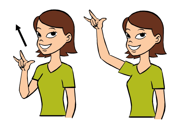
language. While reading these chapters, I immediately thought of sign language.
Sign language works both with iconic symbols and abstract symbols. Some symbols
(such as the sign for chair, or airplane) actually look like a chair, while
others are much more abstract (which would be signs for words that usually don’t
have a physical meaning but usually represent an action that’s related to it).
 |
| ASL for Airplane |
How does this impact our use of images and text in a
hypertext?
On many websites, we have an image that you can
mouse over and a caption will appear. You can then click the image and be led
to a different website, such as the source website. This is particularly
interesting because perhaps clicking image links will lead you to the most
unexpected types of sites – the image does not necessarily represent what the
link represents. That’s where words come in – the caption will clarify what the
picture is, perhaps what it is linked to. Maybe the image is set in with text
that further clarifies why that image is chosen.
Also, images play a part in determining how a reader
understands the written word. While working on the literary magazine for
campus, we always had to think about whether we wanted to juxtapose images with
poetry or prose – because having them both on the page would allow the reader
to pick up different messages, which could either harm the piece, change
meaning, or make someone mad – but it’s a very serious problem.
It’s also interesting how easily we look at text and
image and immediately associate them together. By confining them on a page
(just the same kind of idea that McCloud discussed as confining time into time
frames in comics) everything inside the page is grouped together.
BUT – there are also kinds of texts which we don’t
consider to be related to the written text, or the body of the page, such as
advertisements (which normally fit into their own sphere, and don’t cross into
the body of the page). I would think that these wouldn’t normally change our
reading of the immediate text, but by looking at the overall design of the
website the ads might play a part in deciding what to make of the text (its
credibility, etc).
I guess in a parting note, I would have to say, Yes
to McCloud, I agree, text and images work together to create amazing things,
and also pull each other apart because of their intertextuality, and their desire
to be stand-alone in some cases.


I really like how you incorporated sign language into this! It redefines the stereotype that people who need to use sign language are worse communicators, because in reality they might be vastly better. I found the part where you mentioned looking at a text and image and associate them together as interesting, because of how culturally constructed that is, both depending on the language used as well as the object. Speaking out loud, if I mentioned the word "chair" everyone would have different ideas of what a chair is, but the image included in written writing about the chair creates a collaborative thought. It is necessary for everyone to be on the same page though, to have experience with a chair. This is where the authority that rhetoric uses, comes into play. By establishing an image with an idea there is a sense that everyone knows what you are referring to/talking about, giving the rhetor a range of authority over the audience. Images allow for more control over ideas, but it also enables more control of the audience. Which would be interesting to look at in terms of sign language.
ReplyDelete